The problem was no longer “can we calculate a score?” It was “can users understand whether that score is safe to use?”
The product already had uploaded documents and financial metrics. The next iteration needed a more trustworthy system around them: visible data coverage, explicit parsing and review states, actionable failure recovery, clearer analytics hierarchy and stronger context around financial relationships.
Presence of a file did not prove that the required financial periods were available.
Parsing and validation issues needed to explain both what happened and how to recover.
Non-financial users needed a conclusion and reasoning before a wall of ratios.
Make uncertainty visible before asking users to trust the output
The experience should expose what the system knows, what it could not verify and what needs attention before presenting analytics as decision support.
I moved the experience from upload history to a readiness model
The earlier product treated financial documents mostly as a file list. The redesign surfaces the question users actually have: do we have the required coverage to continue?
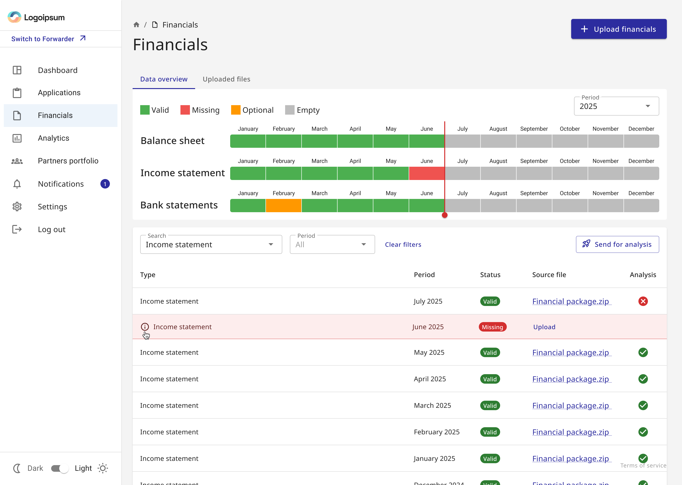
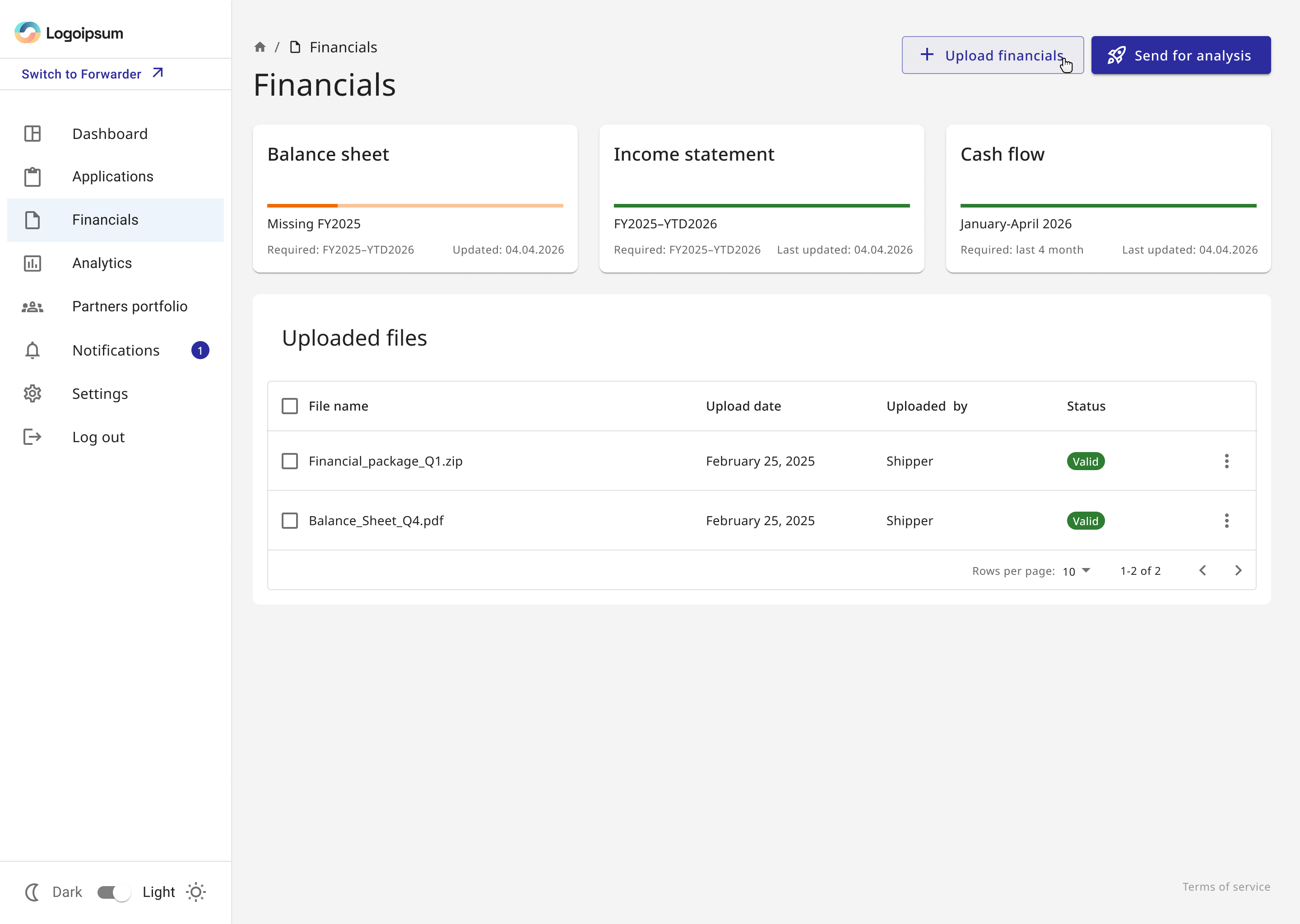
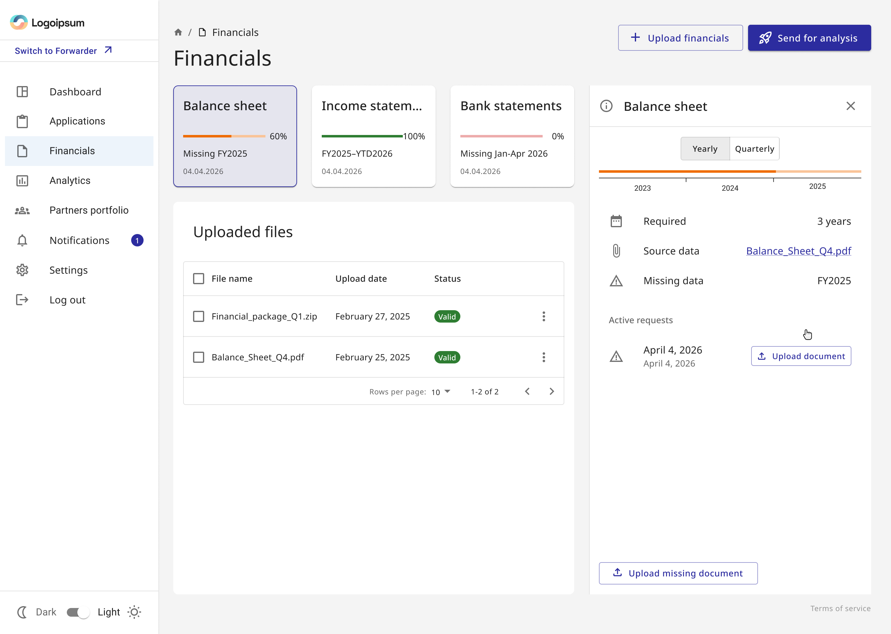
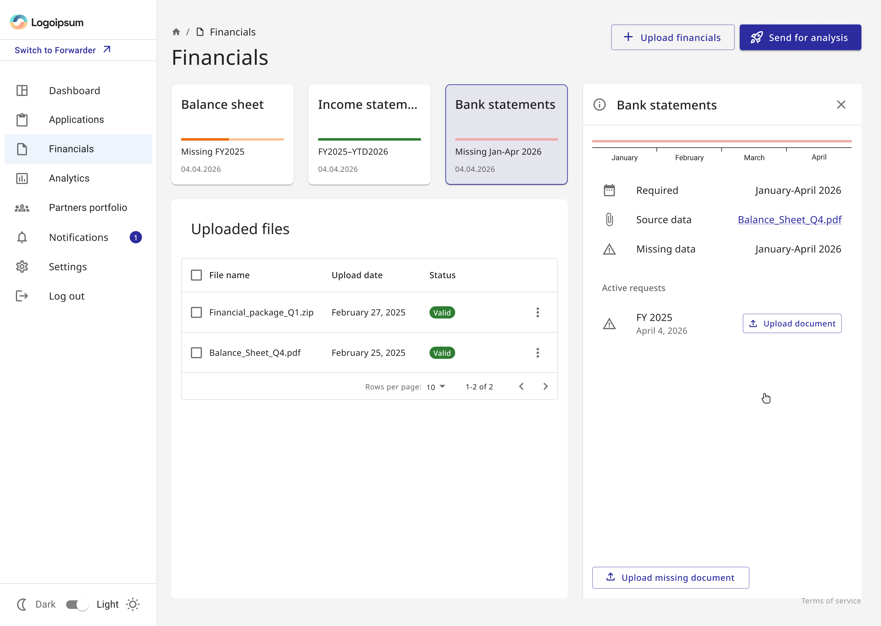
Missing data became actionable rather than informational
Selecting a requirement opens its context: expected period, source data, exact gap and any active request. The user can upload what is missing without reconstructing the rule from a separate screen.
Uploading a file became a visible process with recoverable outcomes
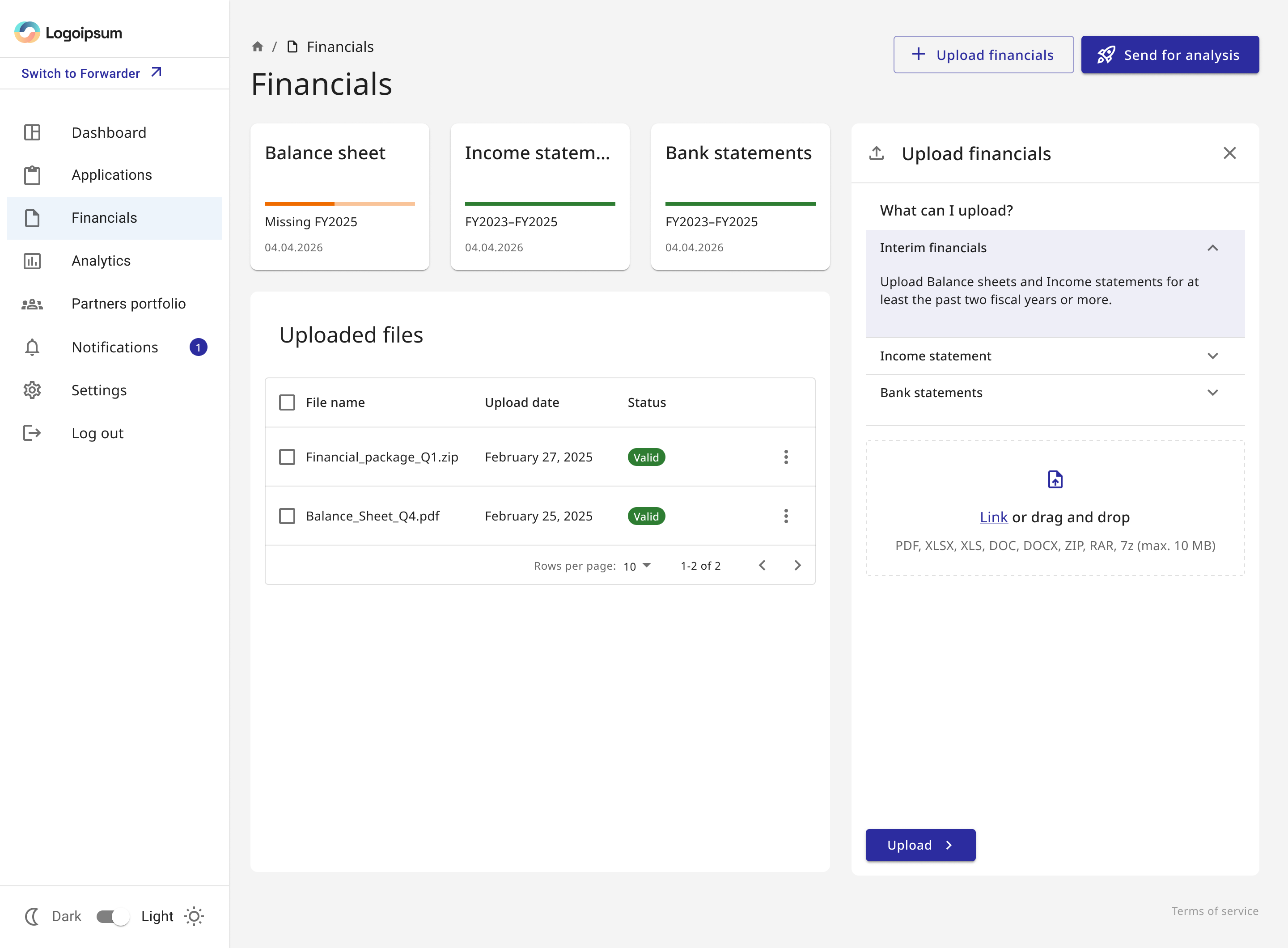
The workflow starts before parsing. Users first need to understand what the product accepts, then see the exact files queued for upload. After that, verification can continue asynchronously — including manual financial review that may take time — without making the upload itself feel stuck.
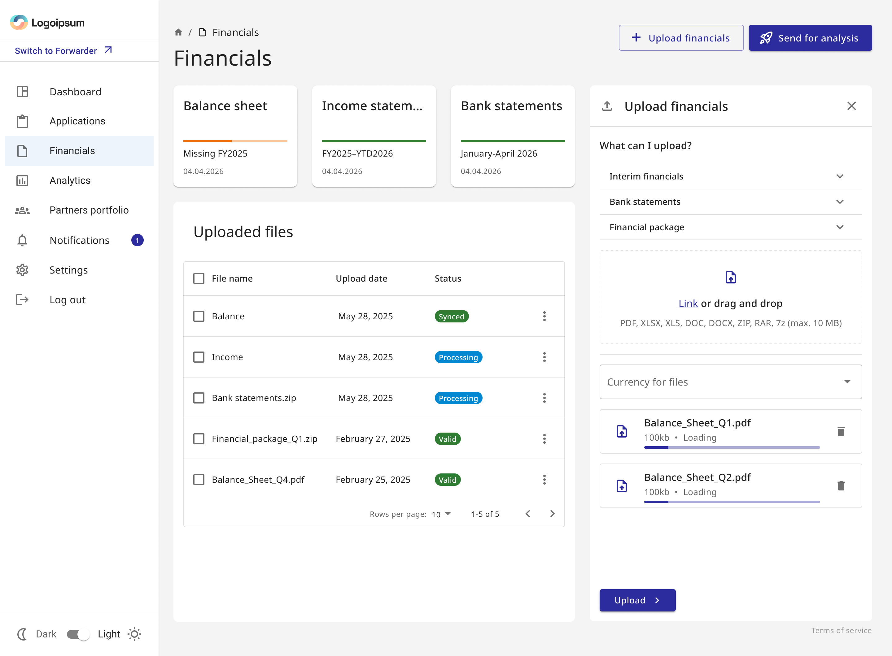
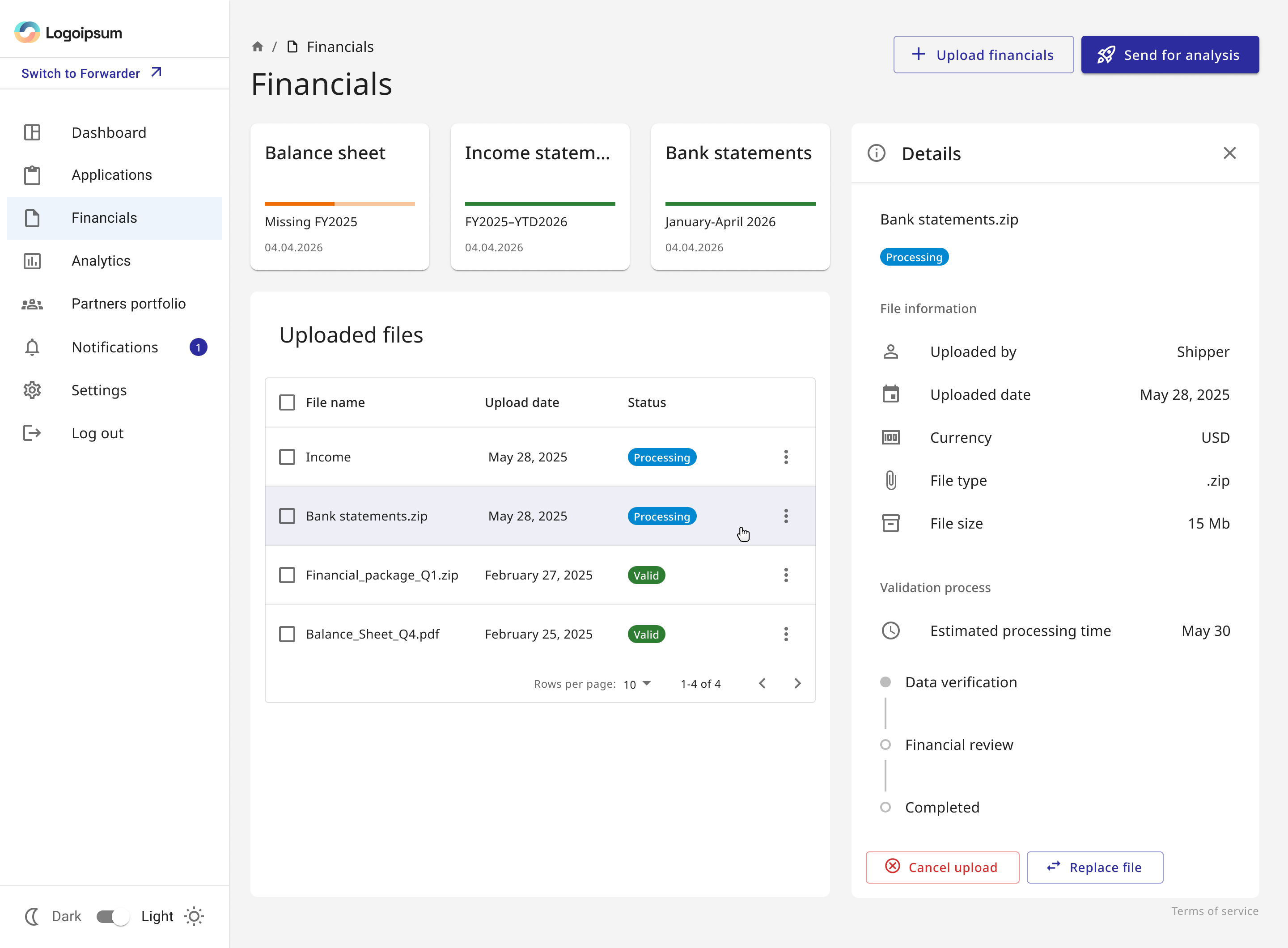
Processing can continue after the upload is complete
Data verification and financial review are separate from transfer progress. Because review may include a manual step, the file details show the current stage and expected timing instead of implying that the user should wait on the upload screen.
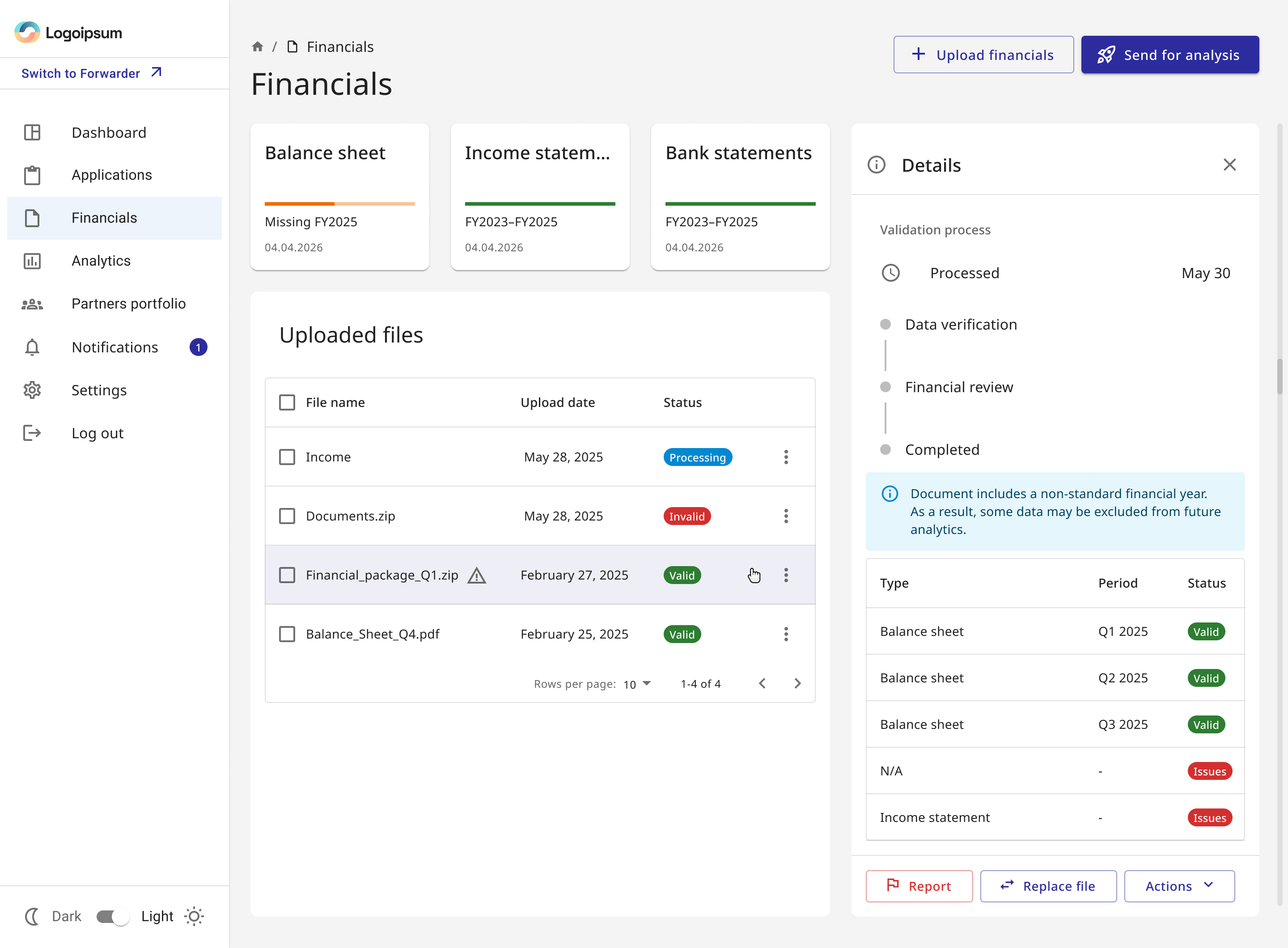
Failure states explain both the problem and the escape route
A generic “failed parsing” message would push users into support. The critical issue state identifies what could not be extracted, shows what remains usable and places recovery actions next to the diagnosis.

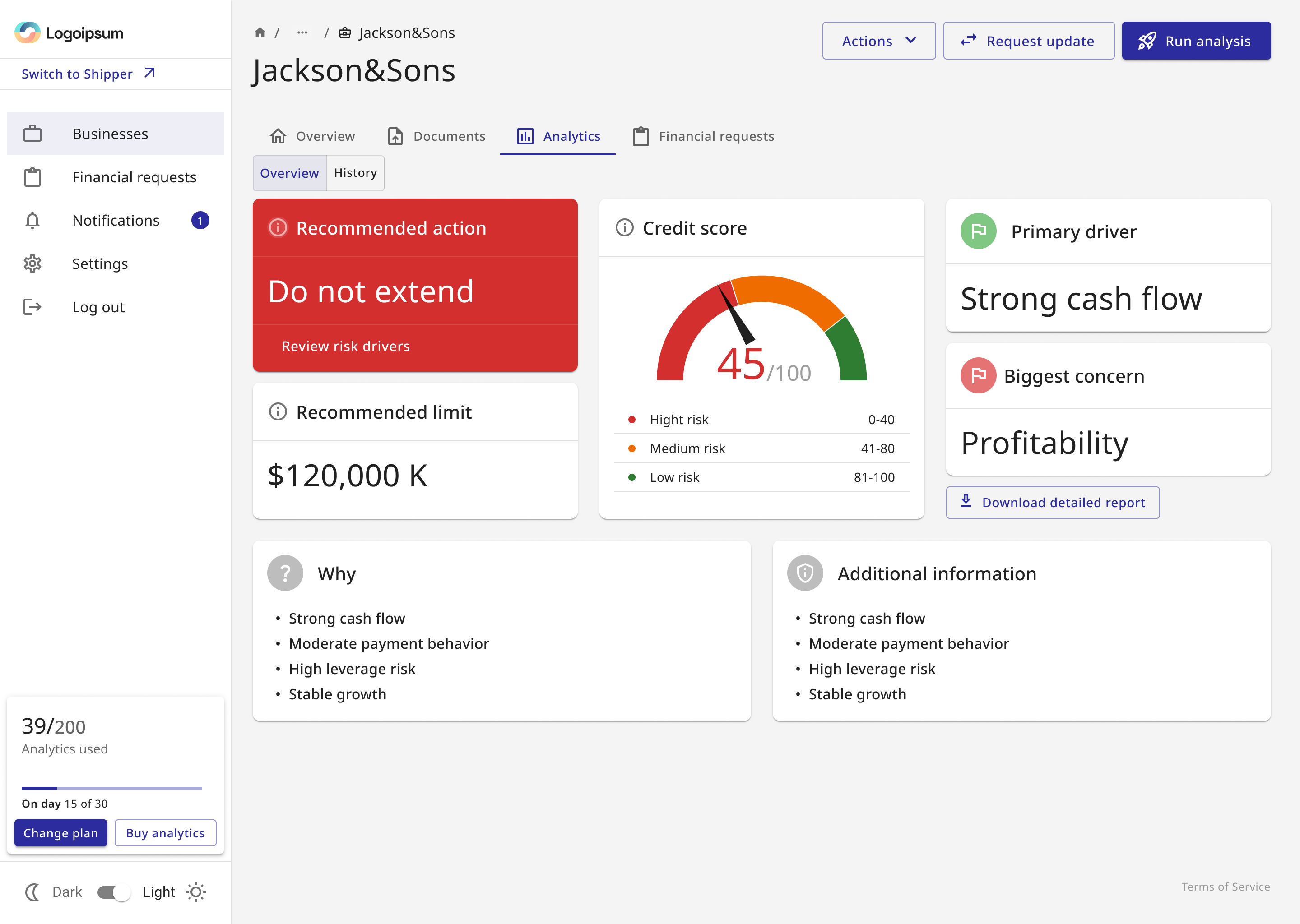
The old dashboard showed metrics. The redesign tells users what they mean for the credit decision.
The previous layout gave individual ratios almost equal visual weight. I reorganized the hierarchy around recommended action → credit score and limit → primary driver and biggest concern → grouped evidence.
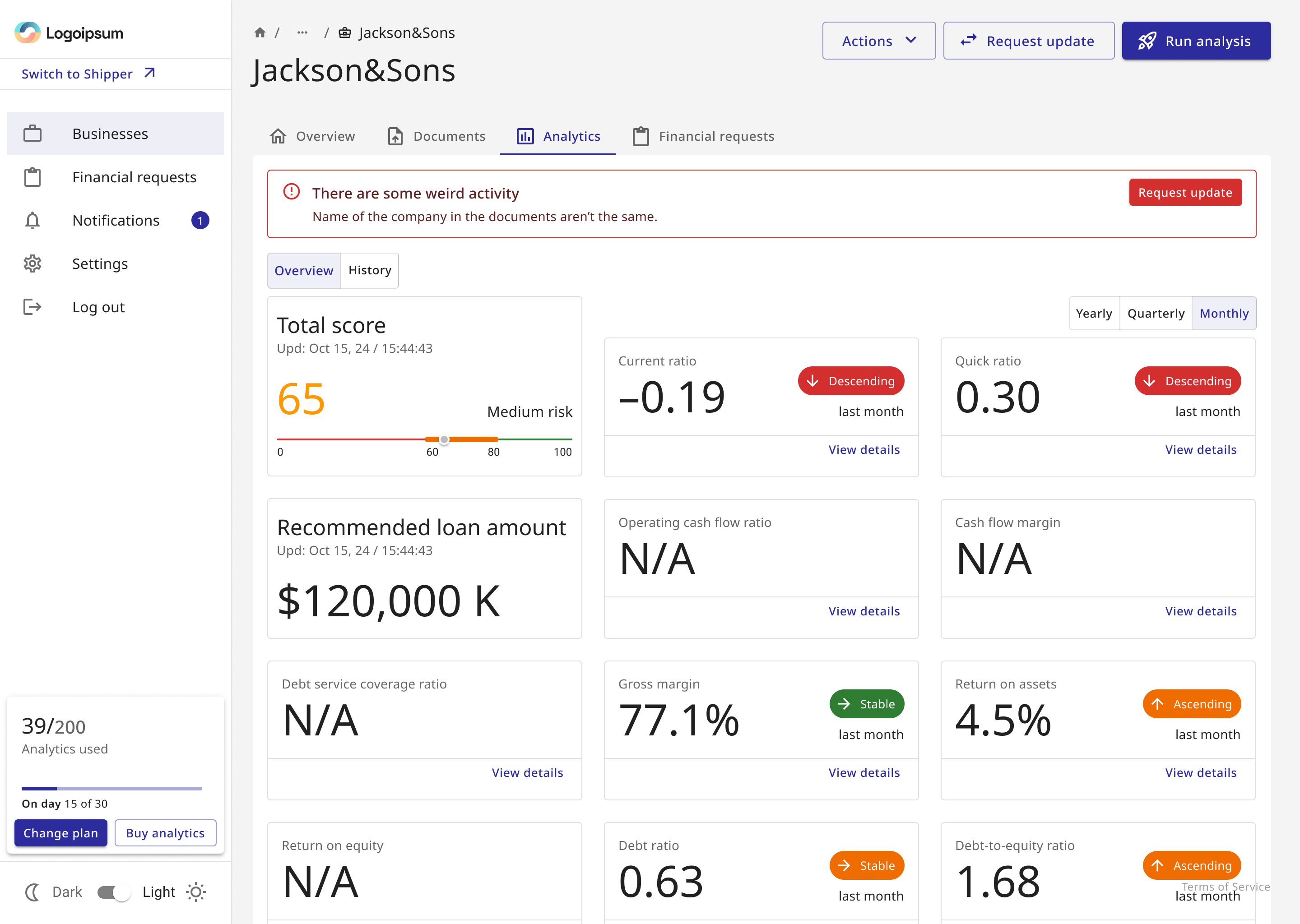
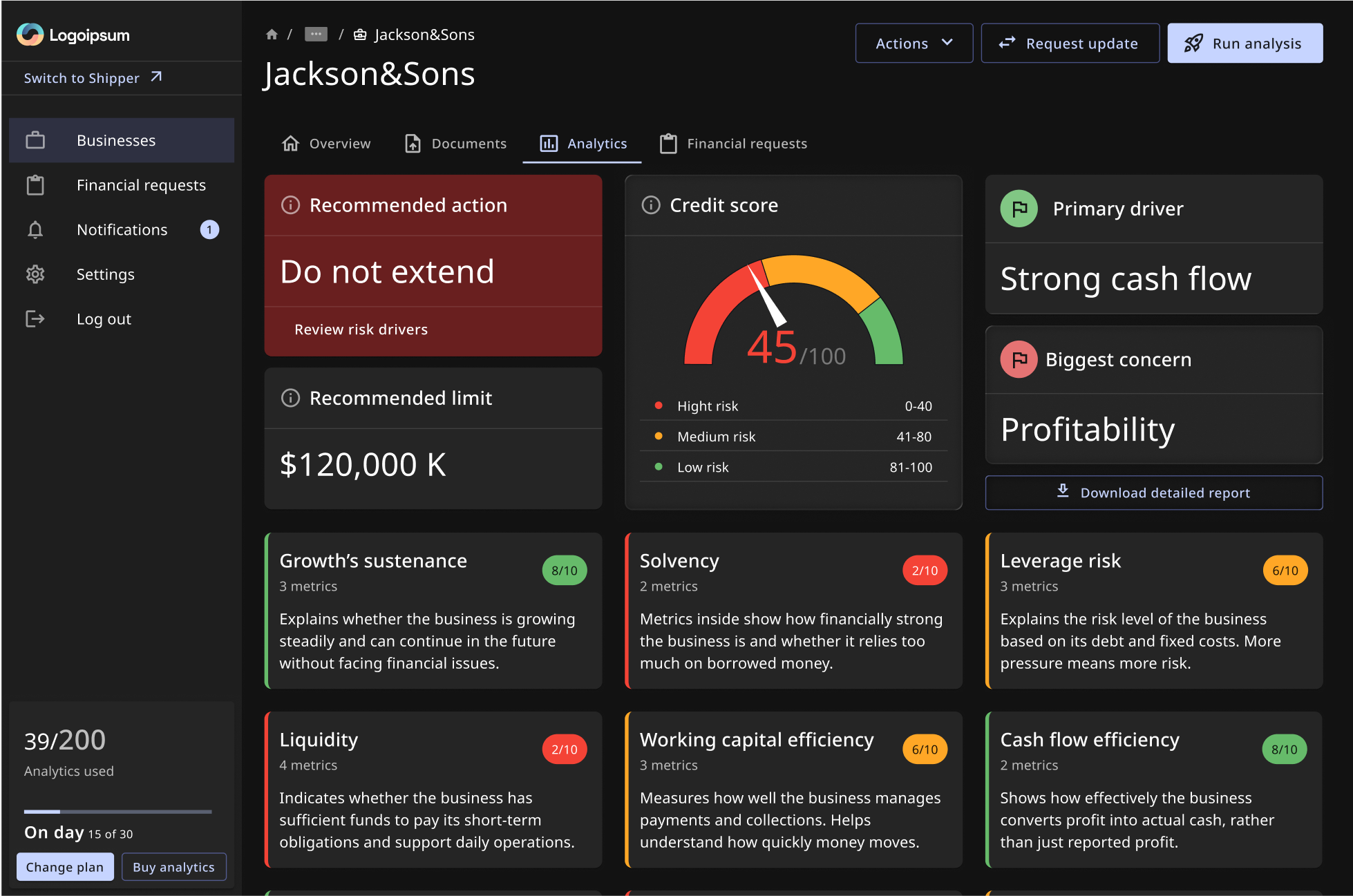
Answer first. Evidence second. Detail on demand.
A user who needs only the business conclusion can stop at the top. A user who needs to validate it can drill into grouped evidence and individual metrics.
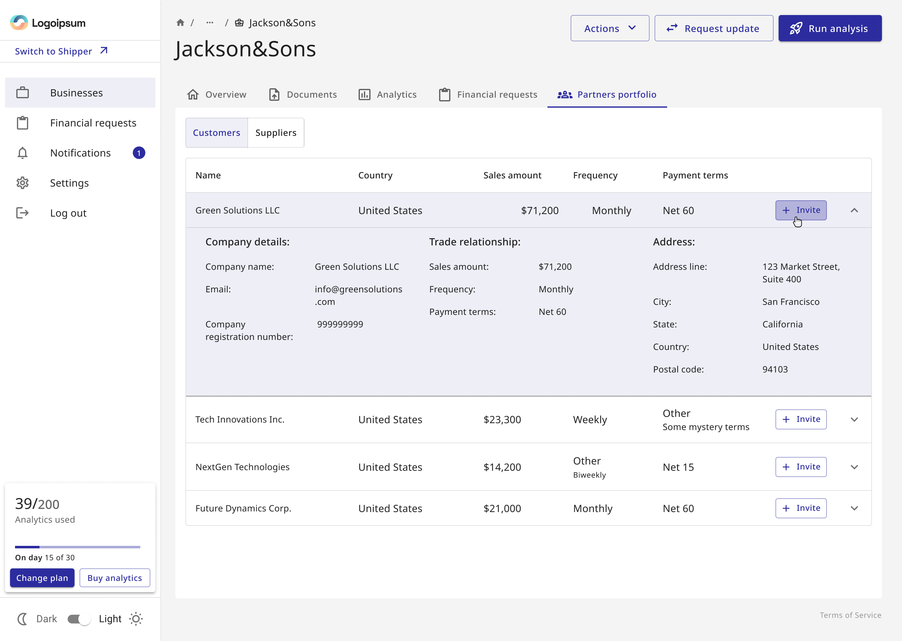
The product started to model financial relationships, not only isolated businesses
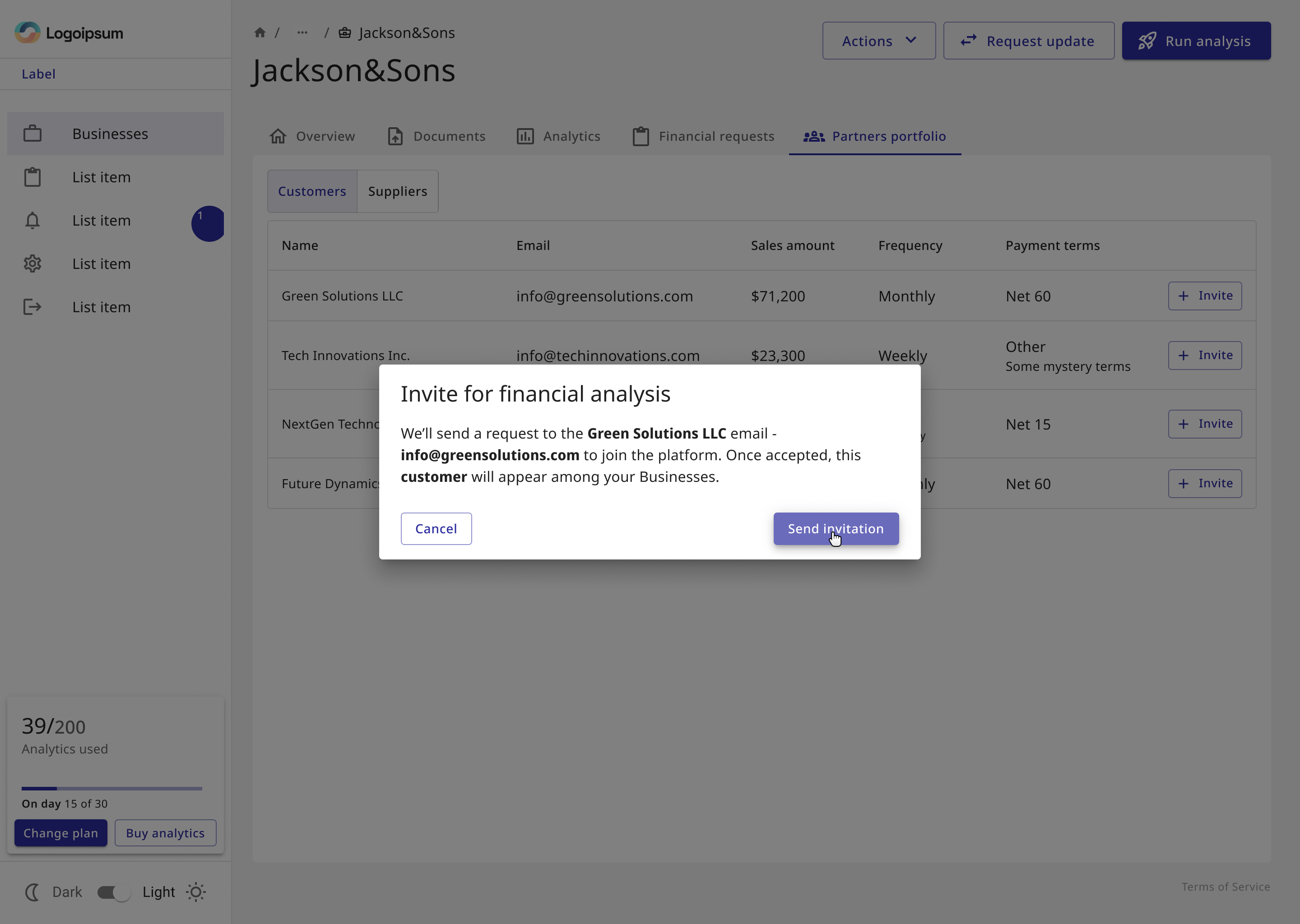
Shippers already have customers and suppliers that matter to financing decisions. I added a partner portfolio so those relationships could become reusable product context rather than repeated form fields.
Support was designed to sit inside the workflow, not behind a documentation wall
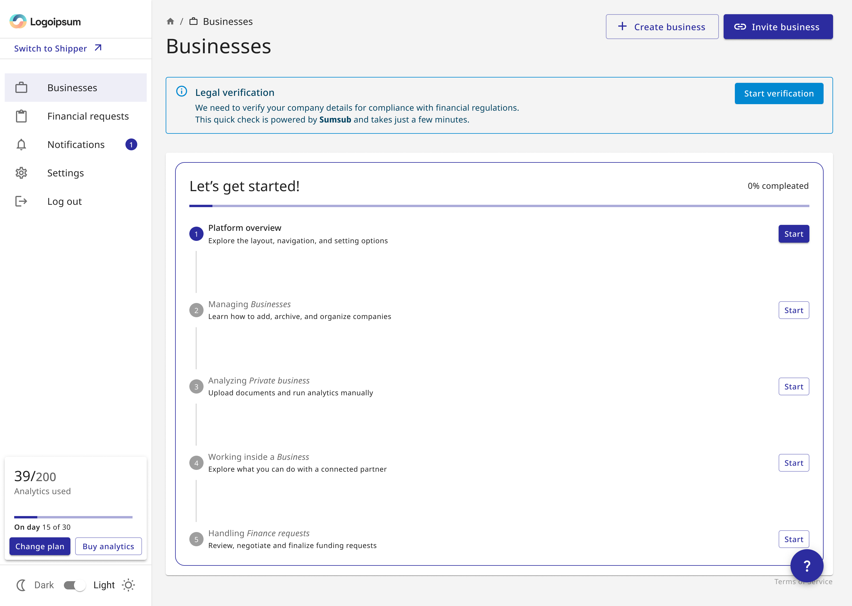
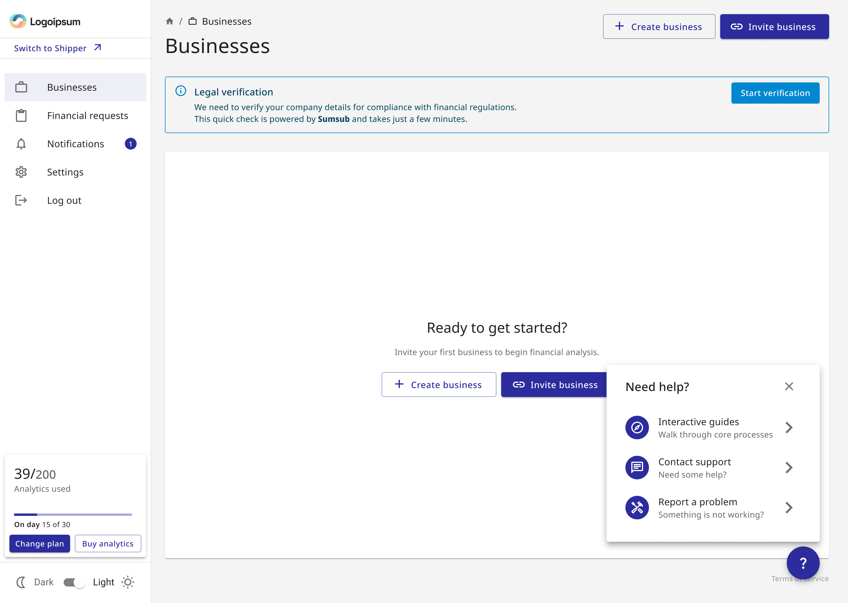
I also explored a Help Center pattern with interactive guides, contextual support and problem reporting. It was designed but not implemented, so I present it here as a product concept rather than a shipped outcome.
The product now connects raw financial evidence, data quality and the final decision in one understandable path
I do not attach invented performance metrics to this work. The contribution is structural: documents, validation, analytics and financial relationships no longer behave like unrelated features.
From “upload and hope” to inspectable decision support
The experience communicates readiness, uncertainty and reasoning at the moments where they matter.