The earlier experience exposed features. The new product needed to expose a journey.
The original model was narrow: users could upload documents, view analytics and move through one credit path. Adding new financing products and a richer forwarder role made that structure increasingly difficult to extend.
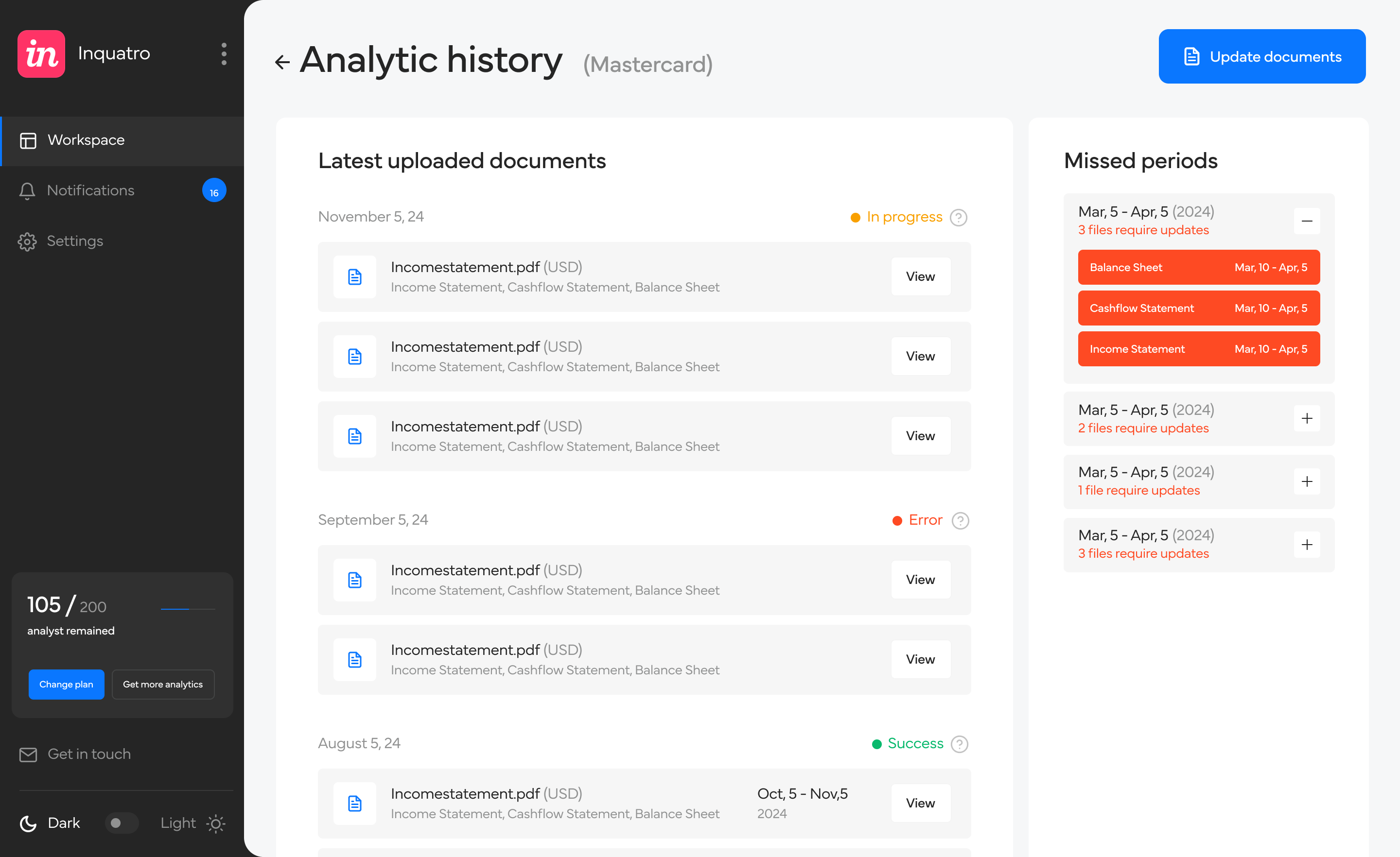
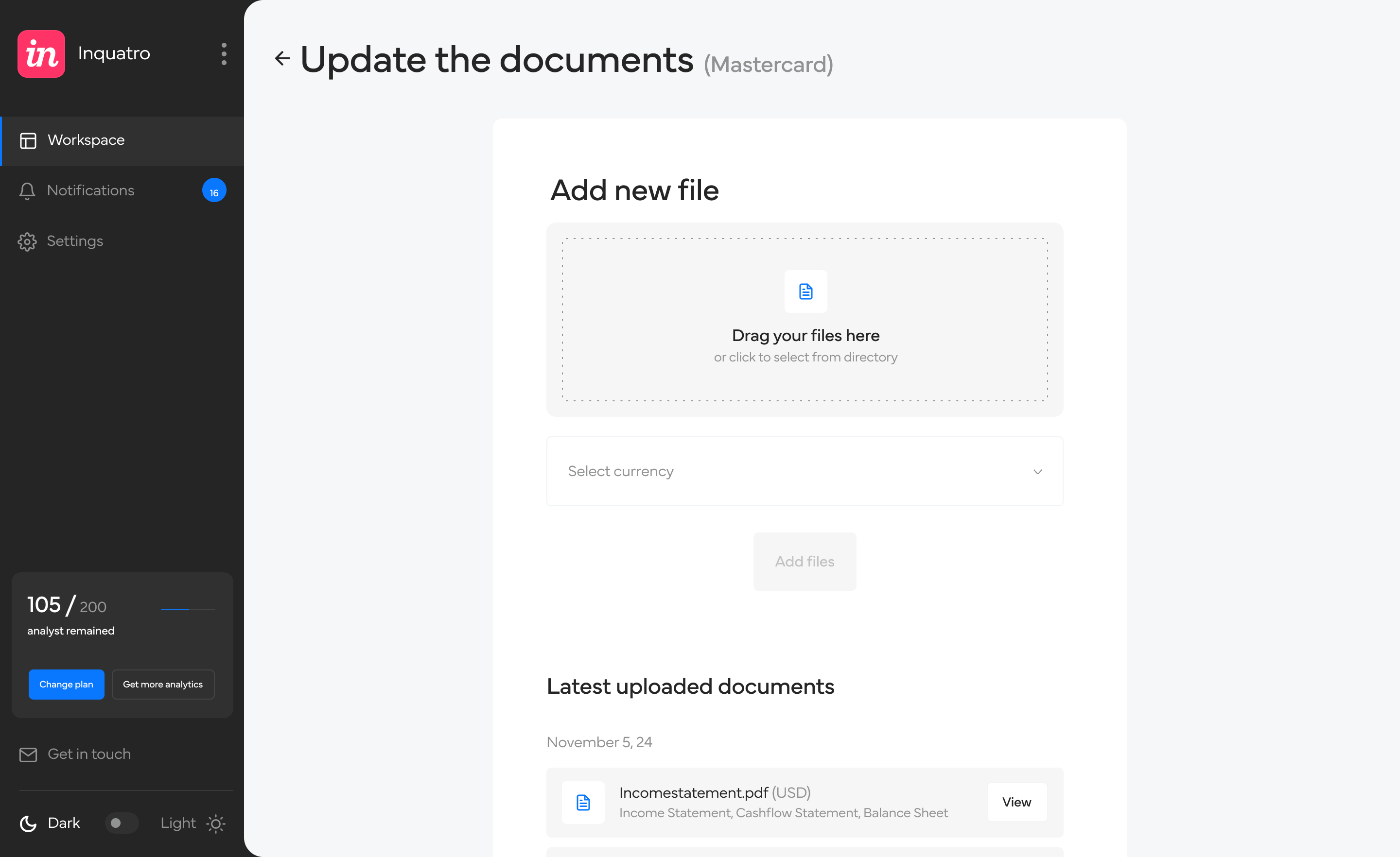
New capabilities needed a structure that could scale beyond one credit flow.
Shippers and forwarders shared data but had different goals and navigation priorities.
Users needed to understand what they could do now, not only what data existed.
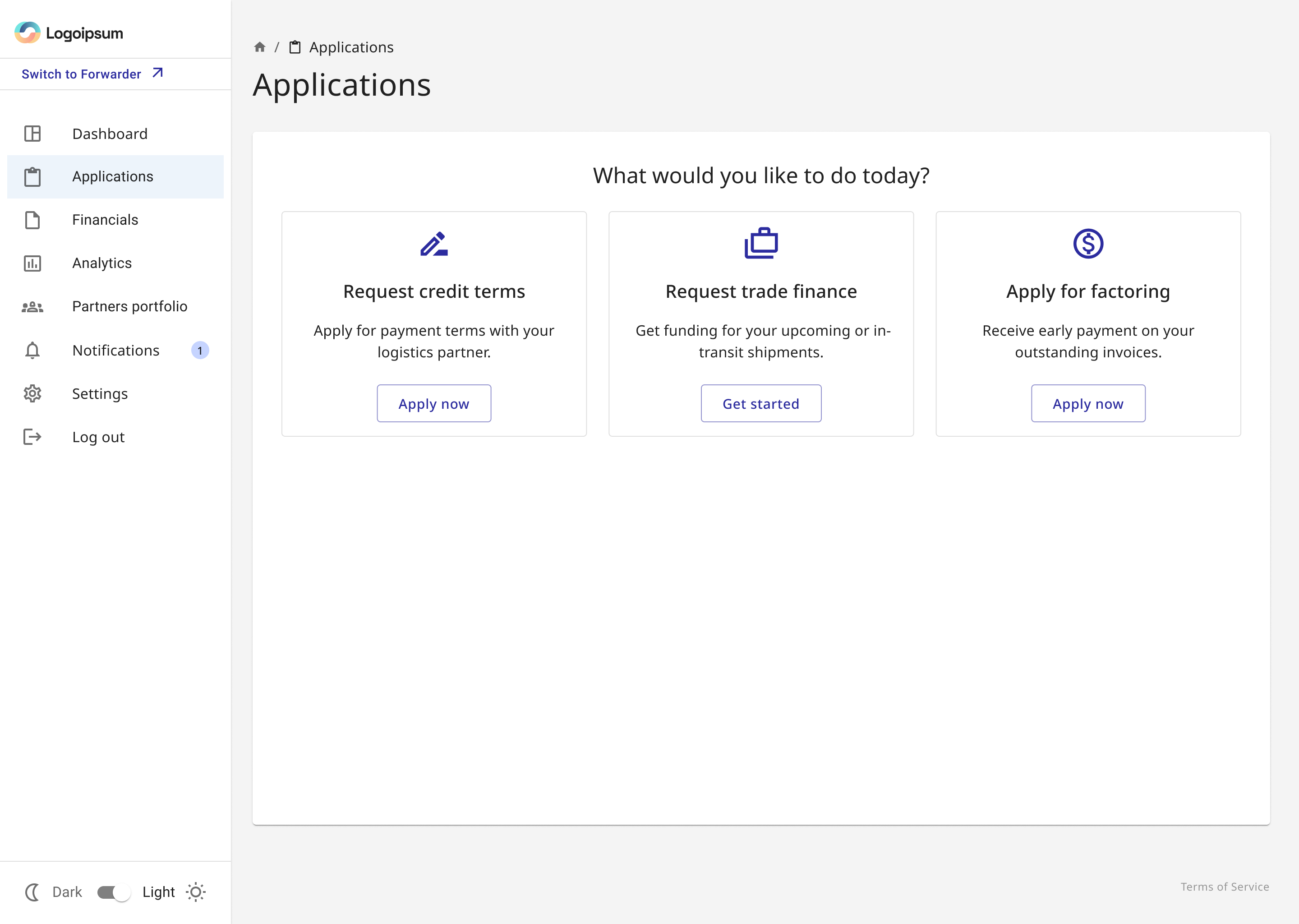
One entry point, three financing products with a shared interaction pattern
Instead of hiding financing behind a generic action, the Applications page explains the available products in business language: Request credit terms, Request trade finance, and Apply for factoring.
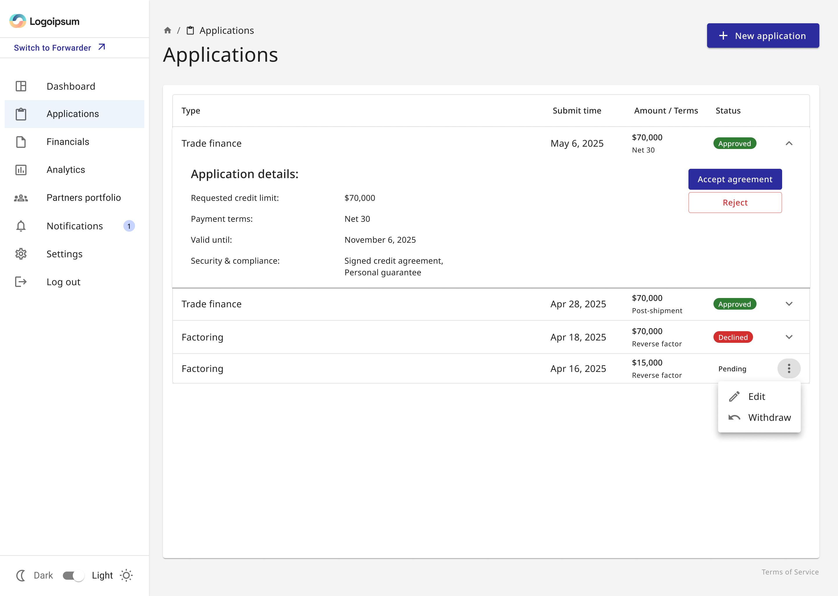
Shared interaction pattern, product-specific questions
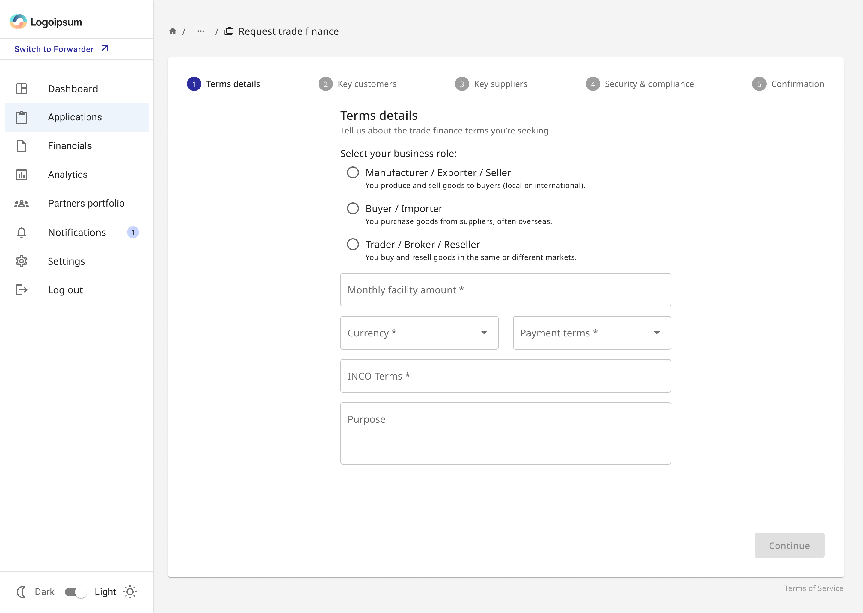
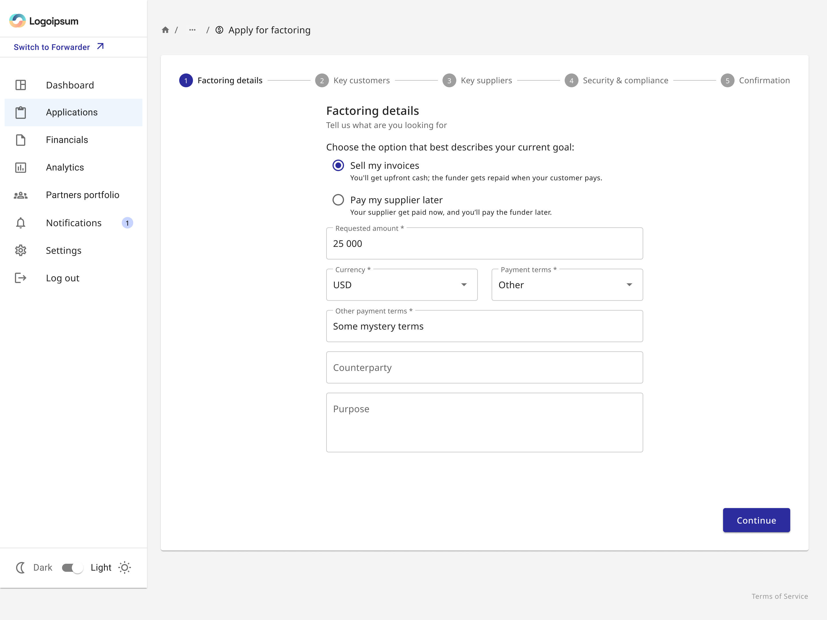
The flow keeps navigation and progression consistent, while the questions change with the financing product. The completed request is shown after the initial steps, before submission, so users can verify the full request before committing.
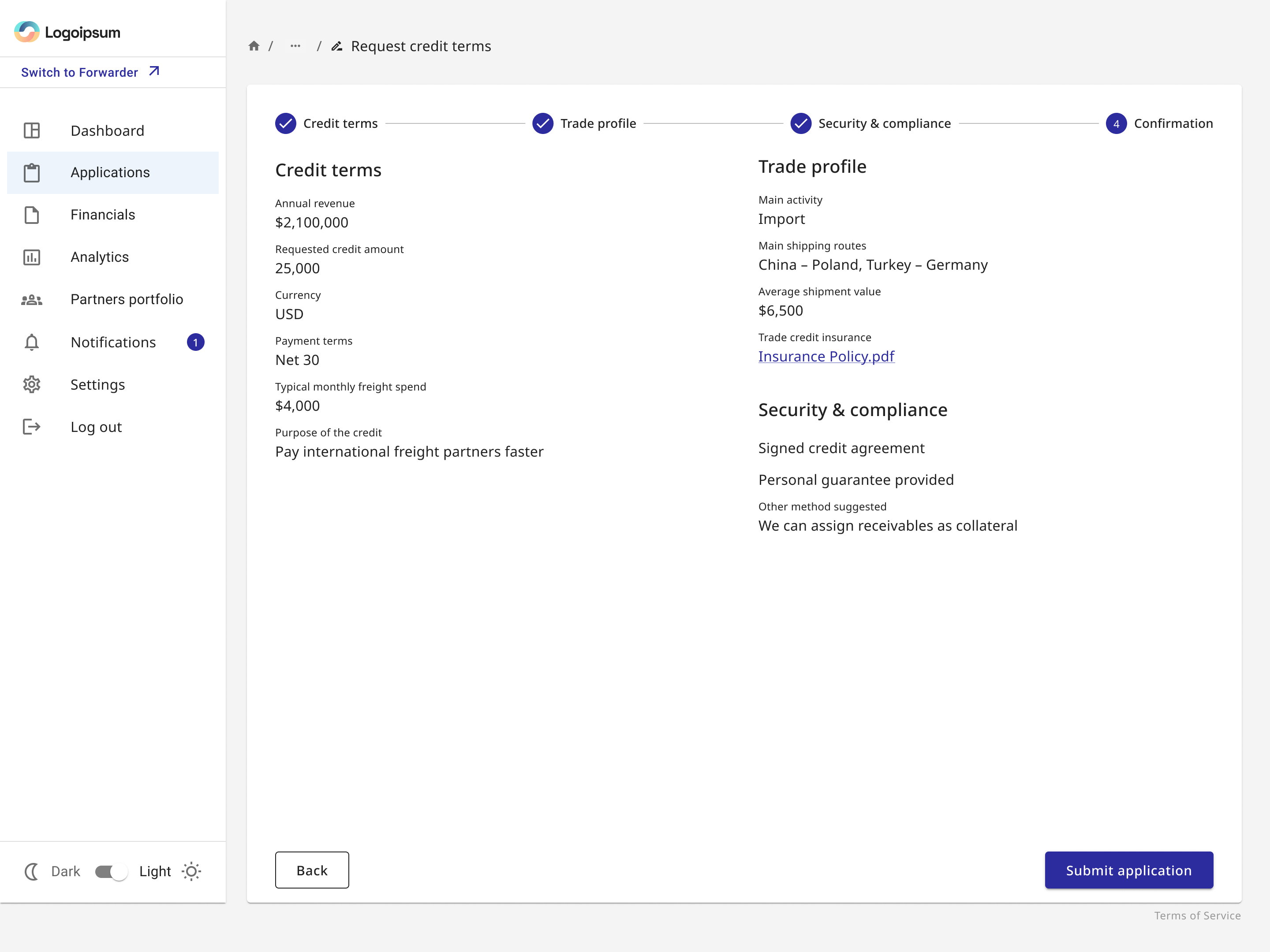

The workflow continues after submission
Applications became manageable objects rather than one-off forms. Users can inspect status and approved terms, accept an agreement, or edit and withdraw a pending request.
A business became more than a card with a score
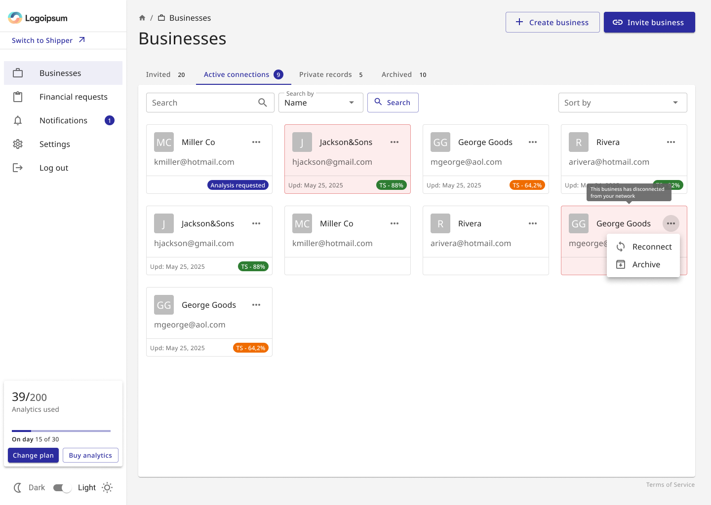
For forwarders, I expanded business management into a relationship model. Invited companies, active connections, private records and archived businesses have different meanings, so the workspace makes those states explicit.
Inside a business, tabs preserve company context across overview, documents, analytics and financial requests instead of sending users back to disconnected global features.
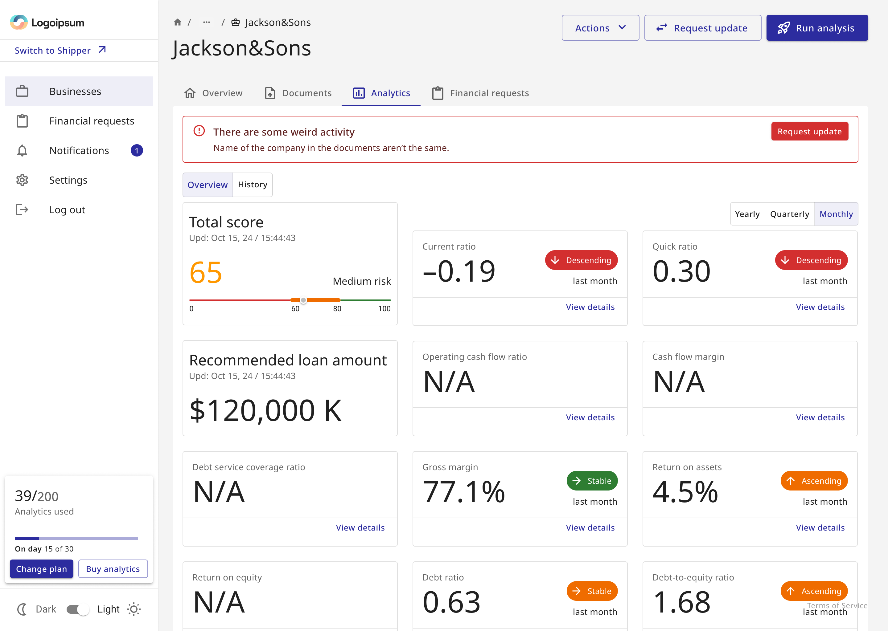
From a file history to an understandable readiness model
In this first iteration, document handling did not yet include processing states or manual review. The problem was more fundamental: users needed to understand whether the required financial periods were present before moving to analysis.
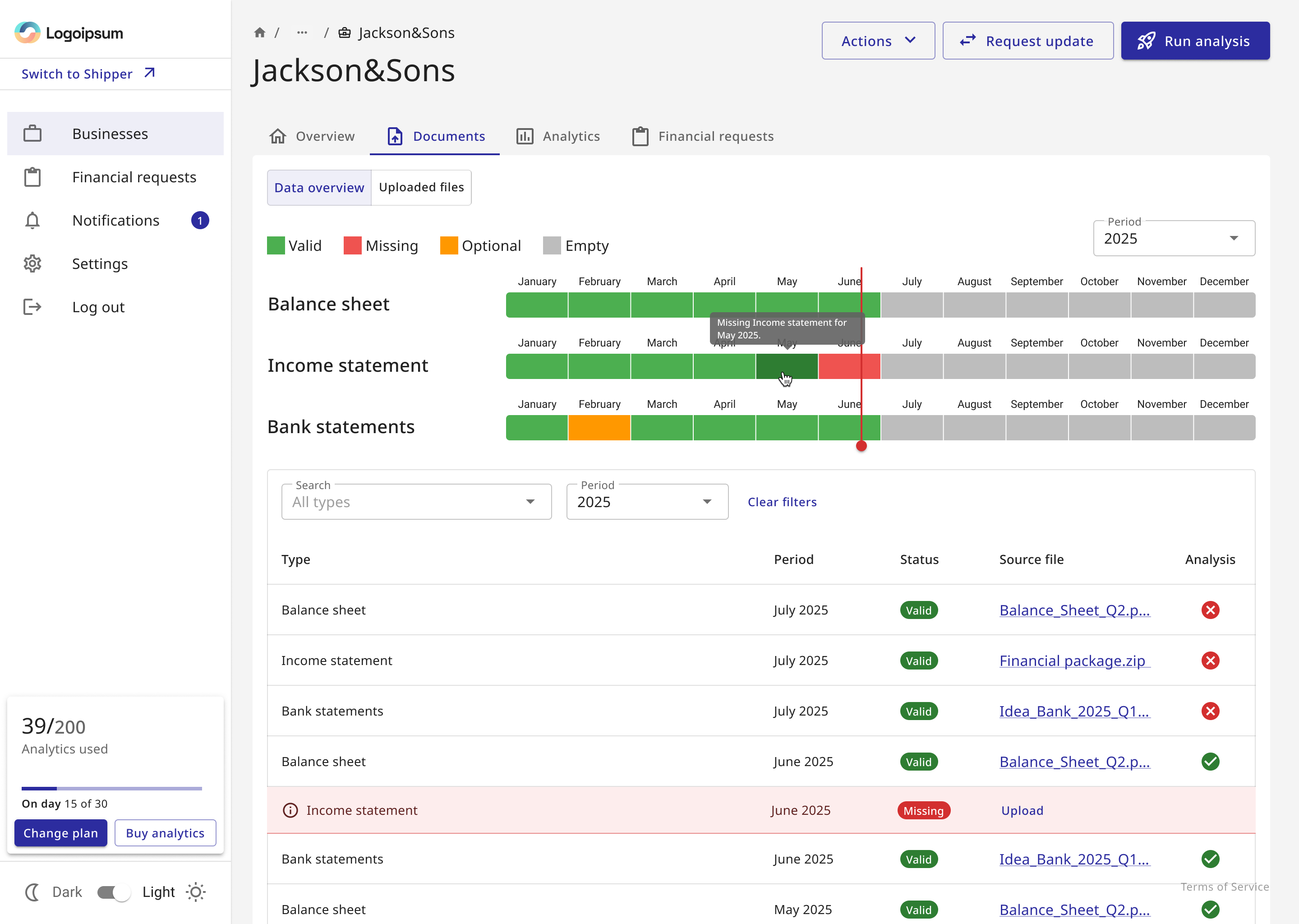
The interface answers “are we ready?” before “run analysis”
Run analysis and its blocked state are outcomes of the same readiness model. The user either has enough required data to continue, or can see what is missing.
The redesign created a product structure that could grow without rewriting the visual foundation
The strongest contribution was architectural: the product gained clearer roles, reusable application patterns, lifecycle states and persistent business context while remaining compatible with the existing Material UI system.
Scale the product model before polishing the surface
The new structure made future financing products and relationship-based workflows easier to add coherently.